

The Psychology of Color in Your Headshot and Branding Wardrobe
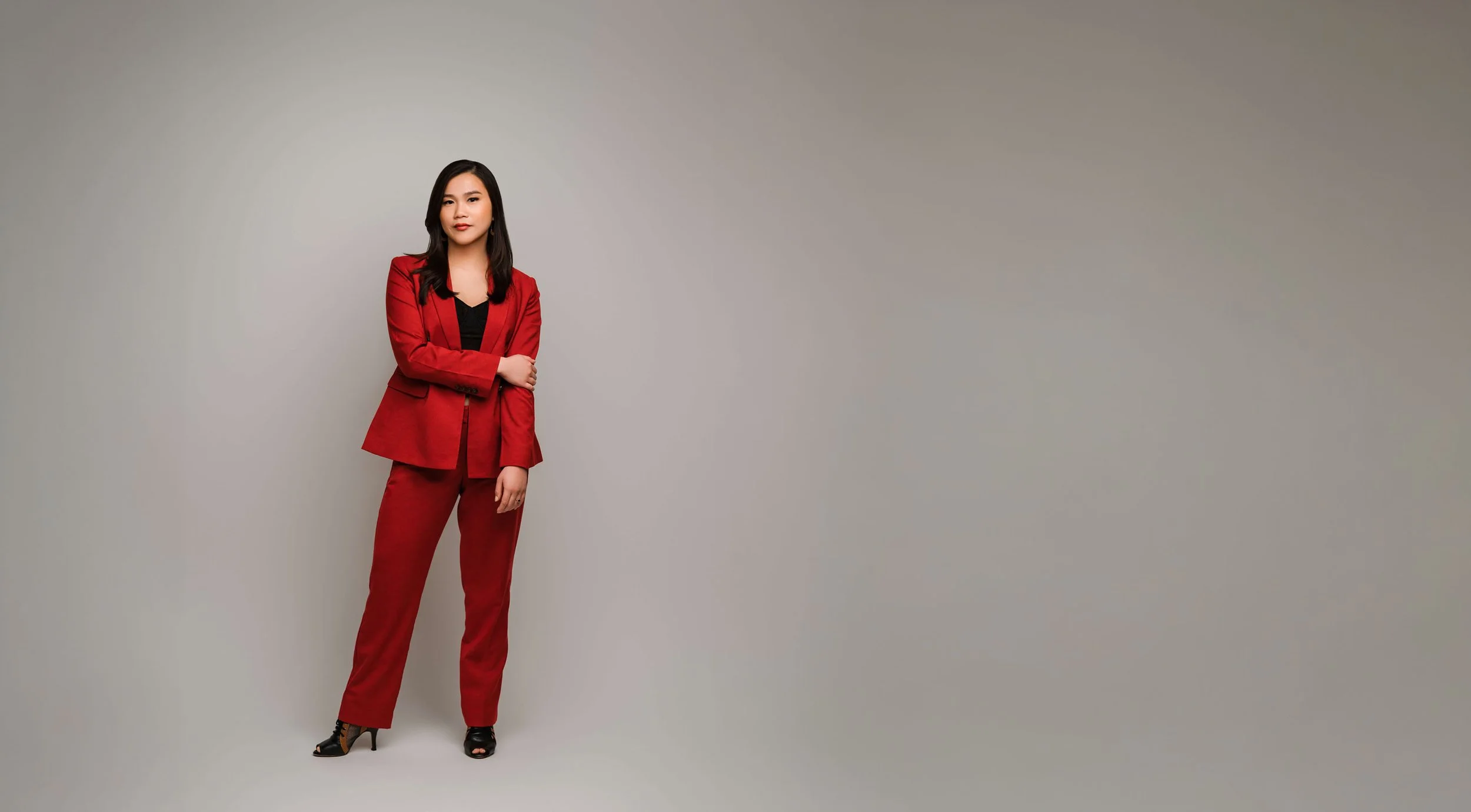
Branding photography and headshot photography is one of those projects that involves so much more detail and strategy than you see on the surface. One of those details is choosing your attire. What you wear for your branding photos has an immediate effect on the first impression that your photos create, which is why I incorporate my professional styling into every Seattle branding photo shootthat I offer. The style, cut, pattern, and fit of your clothes all matter, but today let’s talk about why the colors you choose are so important too.
What Is Color Psychology?
Our brains have created so many mental associations that we aren’t even aware of, and one example of that is color psychology. Color psychology is a concept, documented in ample studies, that specific colors tend to trigger particular emotions and impressions when people see them. You might not even be aware of it, but the presence of certain colors can immediately affect your mood and how you feel about what you’re seeing or experiencing.
This is at play in our daily lives every day (in fact, there’s a good chance that the paint colors you chose for your home were your favorites not just because of how they looked but because of how they made you feel), and branding photography is no exception. The colors you wear in your portraits will affect the first impression that your photos will make on new clients and the way they perceive you.
Which Colors Spark Which Emotions?
There are some slight variations in color psychology from one study to the next, but for the most part, these are the qualities that our brains tend to associate with these colors:
Blue = trust, reliability, thoughtfulness
Red = passion, confidence, boldness
Black = sophistication, authority, power
Green = growth, balance
White = openness, honesty
Orange = creativity
Yellow = optimism, excitement
Purple = luxury, wisdom
Brown = warmth, stability
Pink = youth, compassion
Gray = neutrality, passivity
Keep in mind that this is a fairly general guide, of course, and that the particular shade of color (for example, navy blue vs. sky blue) that you choose can affect the perception too. But this guide can give you a good idea of what to aim for.

How Can You Use Color Psychology in Your Branding or Headshot Photography?
A basic understanding of color psychology is so valuable to branding photography because it allows you to choose colors that align with how you want clients to perceive you and your brand. This seems simple but it can be an impactful way to help your branding photos to send the right message.
If this all feels a bit complex to you, that’s okay, that’s where I can help! When we’re planning your photo shoot, we’ll talk through all the details like how you want to be perceived and how your attire will affect this, and I’ll personally work with you to pick the best pieces to curate the look and feel you want for your photos, alongside all the other elements I’ll incorporate as well to create the perfect image for you.